
strictly a pencil upload this time. this one's next on the block to ink, but that will wait until decent prints are made of the pencil stage. turned out better than i'd hoped. glad i took the time. only last night fixed the reflections on the rim of the dish and corrected a kneecap-- i leave it to you to figure out which knee
cliff's notes: the central figure is styled on Mariana Pineda's statue, The Oracle. i fell in love with that statue the first time i saw it. just a marvelous gestural figure. so evocative. i wanted to homage Pineda's work & pay tribute. by using Pineda's oracle to replace the priestess i wound up triggering a series of changes in the composition...
first by the addition of the putto: a cherubic figure meant, along with the oracle's robes, to evoke imagery associated with the lady of guadalupe-- the putto ordinarily would be supporting a crescent moon, in the original ikonography, whereas in my version would be presenting a choice: the grasshook or the lamp?
the four suits are represented here for the first time: the sigil (or pentacle, in rider-waite; the intersecting alchemical symbol in the dirt), the grasshook (standing in for swords & athames & all that), the lamp (for the clubs / fire symbol), and the bell (standing in for cups / chalices)... which i realize on first glance plays hell with the standard elemental symbolism, but i'm not going to discuss that here because i don't feel like typing & revising for 5hrs to justify myself aloud for an exclusive audience of my own crazybrain
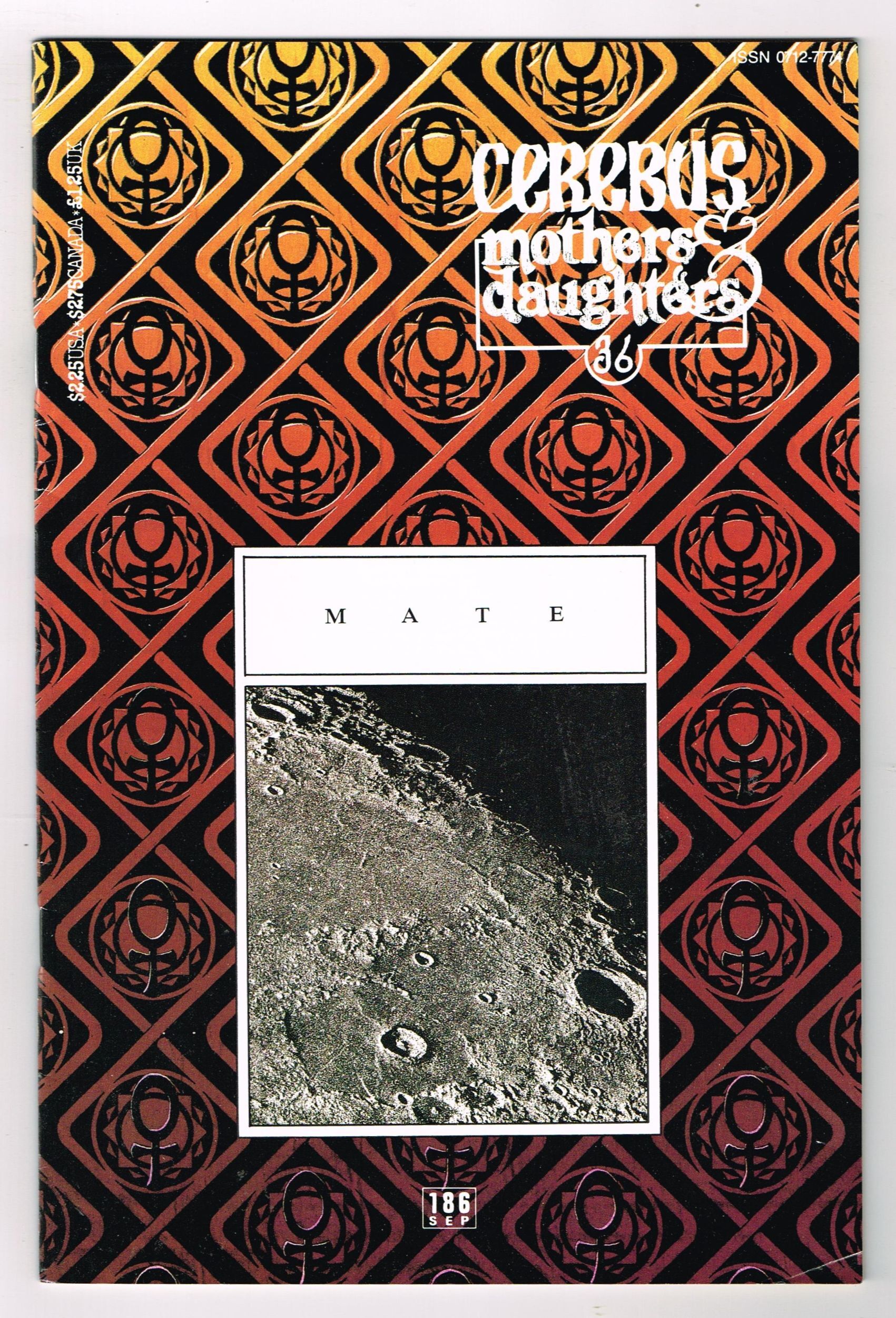
the drapery that hoods the oracle bears a pattern created by the artist known as Gerhard, who endured dave sim on cererbus for more than can be acknowledged in the length of this sentence. the pattern was the background motif of the cover to cerebus 186, inverted here as a cheap counterspell against the diabolickal magicks dave sim indulged in throughout his most infamous work. dave sim was a correspondent of mine for a time, but if he'd known i was gay he wouldn't have spit on me, let alone talked shop about brushes & composition. my mother was a feminist. so fuck dave sim. gerhard's a real one for putting up with that crank
the underside of the drapery is patterned on pamela coleman-smith's original art for the high priestess: this pattern hung between the pillars, behind the priestess. i believe pamela intended the fruit to be pomegranates
the pillars are engraved with the "crown" motif from the imp card-- as is the bell, if you look carefully. the pillars will be explored more in full with other cards, such as 'the initiate' (the revised hanged man card), the lovers, and temperance. these will be different perspectives on the floor of a larger temple. this will be one of several instances of my trying to use the framing device of the cards to offer different perspectives on three-dimensional spaces or objects
i'm interested in the psychological effects this has when the cards are dealt & their meanings juxtaposed: i want to see how they're read as pages in a book dealt out of order
have i mentioned that i am a crazy person?
i think that's all the important stuff. wait, what else? oh, yeah, i forgot to complete my thought earlier, about composition:
by adding the putto to the figure of the oracle you have a subtly queered helix ascending between the pillars. that was my main fixation when building this. composition drove almost all these cards for me. symbolism & mystical interpretations were almost as an afterthought, if i'm honest. it was like that with the imp card, it's been like that with all these. i just follow my OCD and eventually i have art on the other end
...if i'm luckyNext: o - fool
(no, for serious this time)
No comments:
Post a Comment